

I recently updated the CSS on willstrustsestates.info to improve the readability of long tables of contents. The change increases the amount of horizontal space available to each line item, reducing how often text wraps.
When the table of contents includes lengthy terms—like "administrator cum testamento annexo (c.t.a.)"—line wrapping can interrupt the reader’s flow. Fewer line breaks means less visual clutter and faster scanning.
Comparing the Old vs. New
The image below shows a side-by-side comparison. On the left is the Old Version, where text often wraps after just a few words. On the right is the Current Version, where the same entry fits on one line:
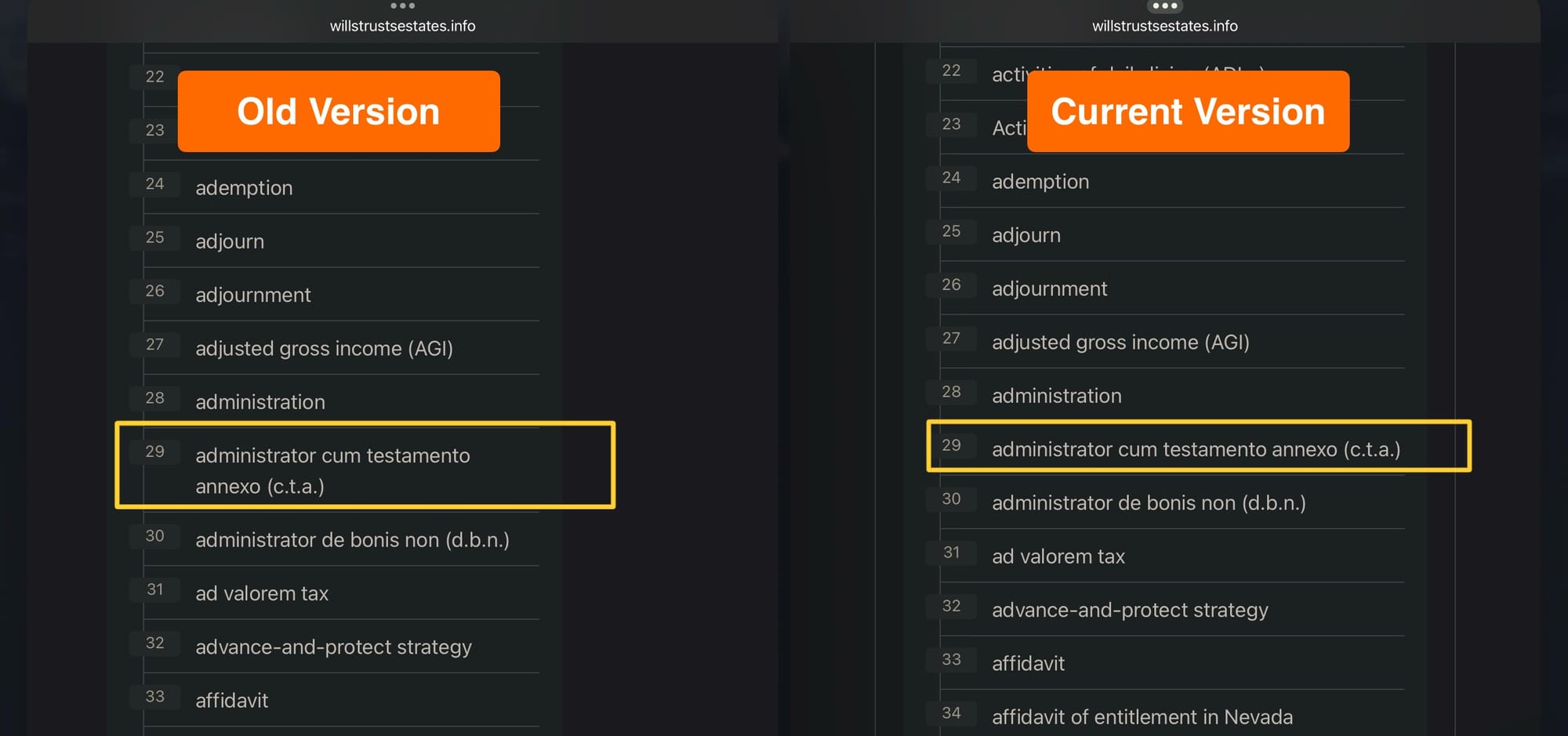
In the updated version, the TOC item "administrator cum testamento annexo (c.t.a.)" fits comfortably on a single line, making the list easier to browse.
What It Looks Like
The image below shows a portion of the new, more compact table of contents in a recent post:
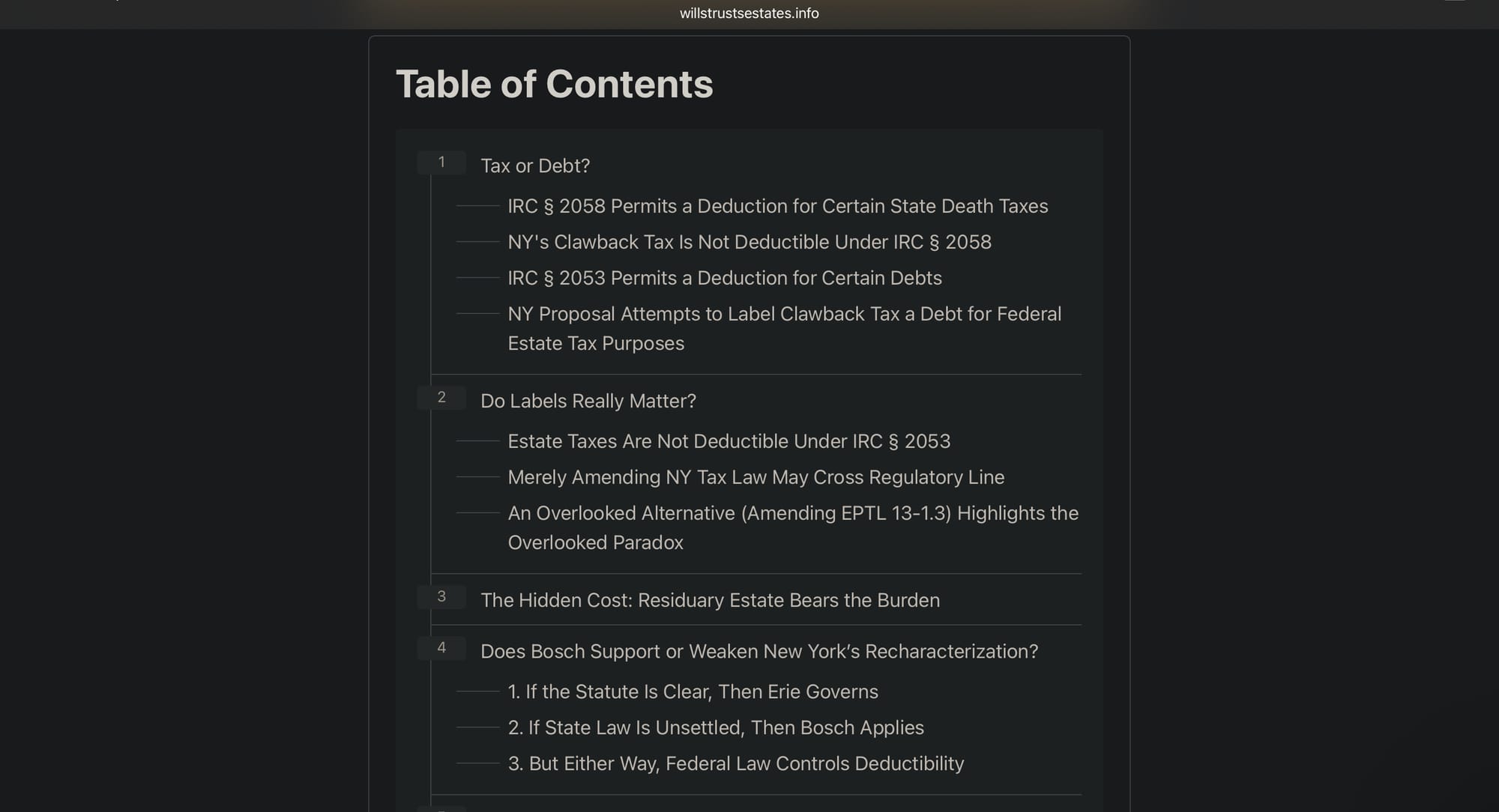
Long section titles—like "An Overlooked Alternative (Amending EPTL 13-1.3) Highlights the Overlooked Paradox"—are now easier to scan without wrapping across multiple lines.
How I Did It
I injected new CSS into the site footer using Ghost’s code injection tool. The changes included adjusting widths and margins for the .toc-wrap and .toc-list containers, adding padding and borders for a more structured look, and styling list items for better legibility. I also added styling for collapsible sections, introduced dotted borders to guide the eye through nested headings, and ensured that long links wrap naturally rather than overflowing or forcing breaks.
Small change, Big difference
Better TOC formatting means readers can focus on content, not formatting distractions. This tweak is part of an ongoing effort to make the site more user-friendly for readers.


Leave a Comment